

Design & Style Your Form
Change the display type, width, spacing, colours and fonts — or drop in your own CSS and JavaScript.
Step 1 - Open The Design panel
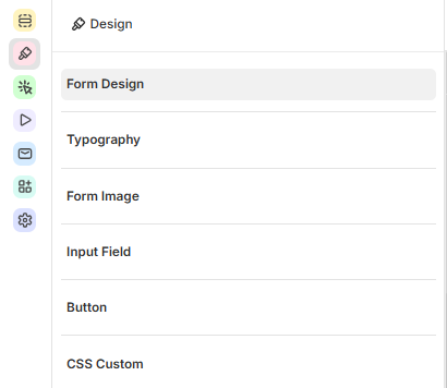
In the form builder, click the Design icon (brush) in the icon rail on the left.
The panel has six sections: Form Design, Typography, Form Image, Input Field, Button and CSS Custom. Click a section to open it, and click the back arrow to return to the list.
Step 2 - Choose the form type and layout
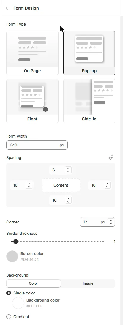
Click Form Design to set up the form container:
Form Type - how the form appears: On Page, Pop-up, Float or Side-in. Click a type to switch - the preview updates right away.
Form width - the maximum width of the form.
Spacing - the space around the content. Click the link icon to set all four sides at once.
Corner, Border thickness and Border color - the shape and border of the form.
Background - a Color (single color or gradient) or an Image.
Step 3 - Style the text, fields and buttons
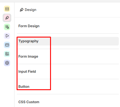
Typography - choose one Font for the whole form, then set the size, style and color of the Label, Description, Placeholder, Options and Button text.
Form Image - add an image to the form.
Input Field and Button - change the look of the fields and buttons.
Step 4 - Preview and save
Use the device icons in the toolbar to check the form on desktop and mobile, and Test forms to try a real submission. Then click Save.
Advanced: Custom code and schedule
Click the Settings icon (gear) in the icon rail for more options:
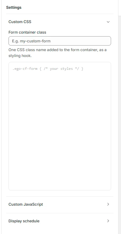
Custom CSS — add a Form container class (a CSS class name added to the form) and your own CSS for this form.
Custom JavaScript — run your own JavaScript when the form loads or is submitted. This is for advanced users.
Display schedule — set a Start date and Start time for the form. Tick Set end date and time to stop showing it after a certain date.
Still need help?
Our support team is available 24/7. Contact support →