

Add & Configure Form Fields
The element library, how rows and columns work, and the settings every field shares.
Overview
A form is made of elements - fields, text, images, and more - arranged in rows on one or more pages. You add and edit elements in the Elements panel of the form builder
Step 1 - Add an element
In the structure on the left, click Add element:
Inside a Row - to add the element to that row, next to the existing fields
below a Rows - to add the element in a new row
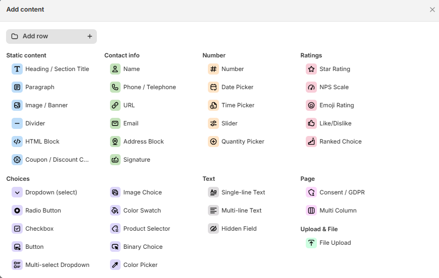
The Add content library opens. Click an element to add it
To add an empty row first, click Add row at the top of the library
Step 2 - Set up an element
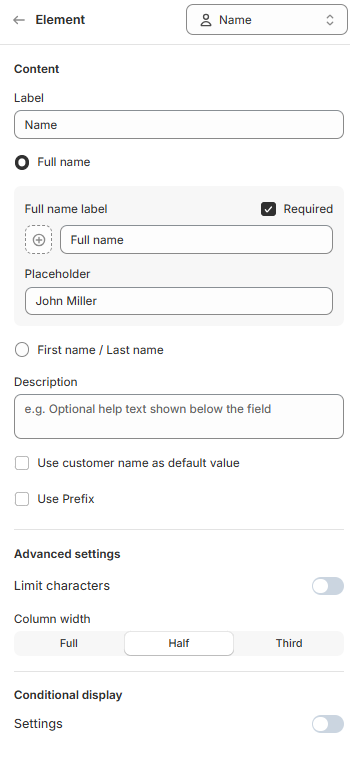
Click an element in the structure or in the preview to open its settings. The settings depend on the element. For example, a Name field has:
Label - the text shown above the field. It is also the column name in Responses
Required - customers must fill in the field before they can submit
Placeholder - example text shown in the empty field
Description - optional help text below the field
Use customer name as default value - fills in the name of logged in customers
Limit characters - sets a minimum and maximum length
Column width - Full, Half or Third. Use Half or Third to place two or three fields side by side in one row
To show or hide an element based on earlier answers, use Conditional display. See Multi-step Forms & Condtitional Display
Step 3 - Edit the header and footer
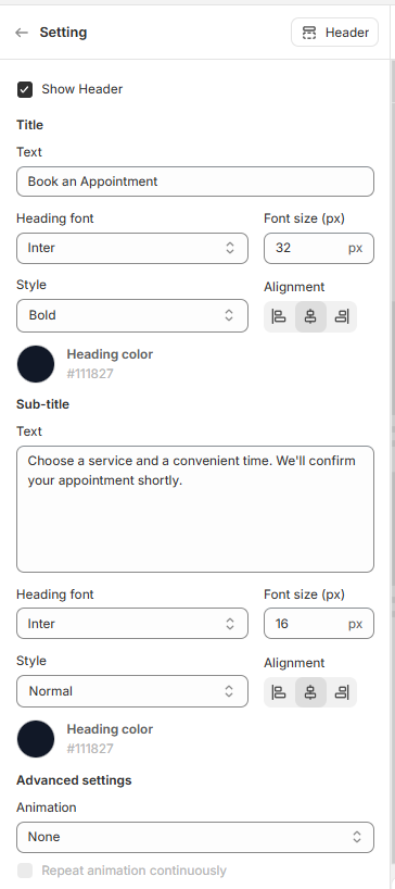
Click Header at the top of the structure to edit the top of the form:
Show Header - untick to hide the header
Title and Sub-title - the text, font, font size, style, alignment and color of each line
Animation (under Advanced settings) - animate the header when the form appears
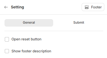
Click Footer at the bottom of the structure to edit the content below the form in the same way
Click Save when you're done
Still need help?
Our support team is available 24/7. Contact support →