
Customizing Survey Appearance
Colors, backgrounds, logos, positions — styled per channel, with a live preview.
Overview
You can customize how your survey looks in the survey builder. Every change shows right, away in the preview, so you can check it before saving
The main places to customize are:
Survey Banner - the colored bar at the top of the survey
Welcome Screen - the intro screen before the first question
Channel settings - the position, colors, buttons and logo of the survey widget on each channel
Step 1 - Style the Survey Banner
In the Questions tab, click Survey Banner. Make sure its toggle is on
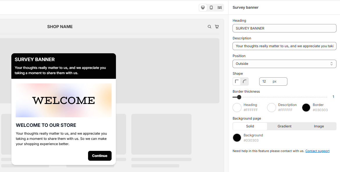
In the settings panel on the right, edit:
Heading and Description - the text in the banner
Position - where the banner sits, for example Outside the survey
Shape - square or rounded corners, and the corner size in px
Border thickness - the width of the border
Colors - for the heading, description and border
Background page - a Solid color, a Gradient or an Image
Step 2 - Set up the Welcome Screen
In the Question tab, click Welcome Screen. Make sure its toggle is on
Edit the Heading, Description and Button text
Optional: click Browse File to add an image (.svg, .jpg, .jpeg or .png), for example your logo or a banner.
Step 3 - Style the survey widget
The look of the survey widget is set per channel, so the same survey can look different on each channel
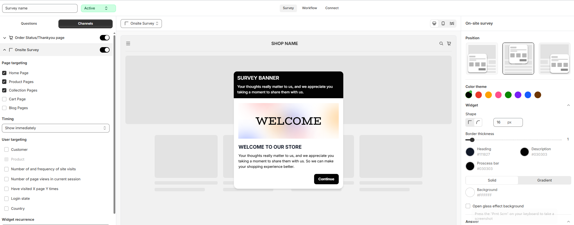
Click the Channels tab and click the arrow next to a channel, for example Onsite Survey.
In the settings panel on the right, customize:
Position - where the widget appears on the page: bottom left, center or bottim right
Color theme - pick a present color to style the whole widget at once
Widget - the corner shape, border, colors of the heading, description and progress bar, and the background (Solid or Gradient). Tick Open glass effect background for a frosted-glass look
Answer - the corner shape, border and text color of the answer options
Button - the button labels (Back, Next, Submit), shape, border, and colors for the default and active states
Side logo - turn on and click Browse File to show your logo next to the survey
Still need help?
Our support team is available 24/7. Contact support →